Background
The client already has some main concepts but needs our help with UI design. We assist by creating key screens and main flows and developing a prototype not only for user testing but also for demo purposes to potential investors.
The app is a social engagement and peer recognition platform for employees, allowing them to read company-related news, participate in polls, post new events, chat with colleagues, send badges for peer recognition, and view and cash out their earned salary up to date.
WIREFRAMES
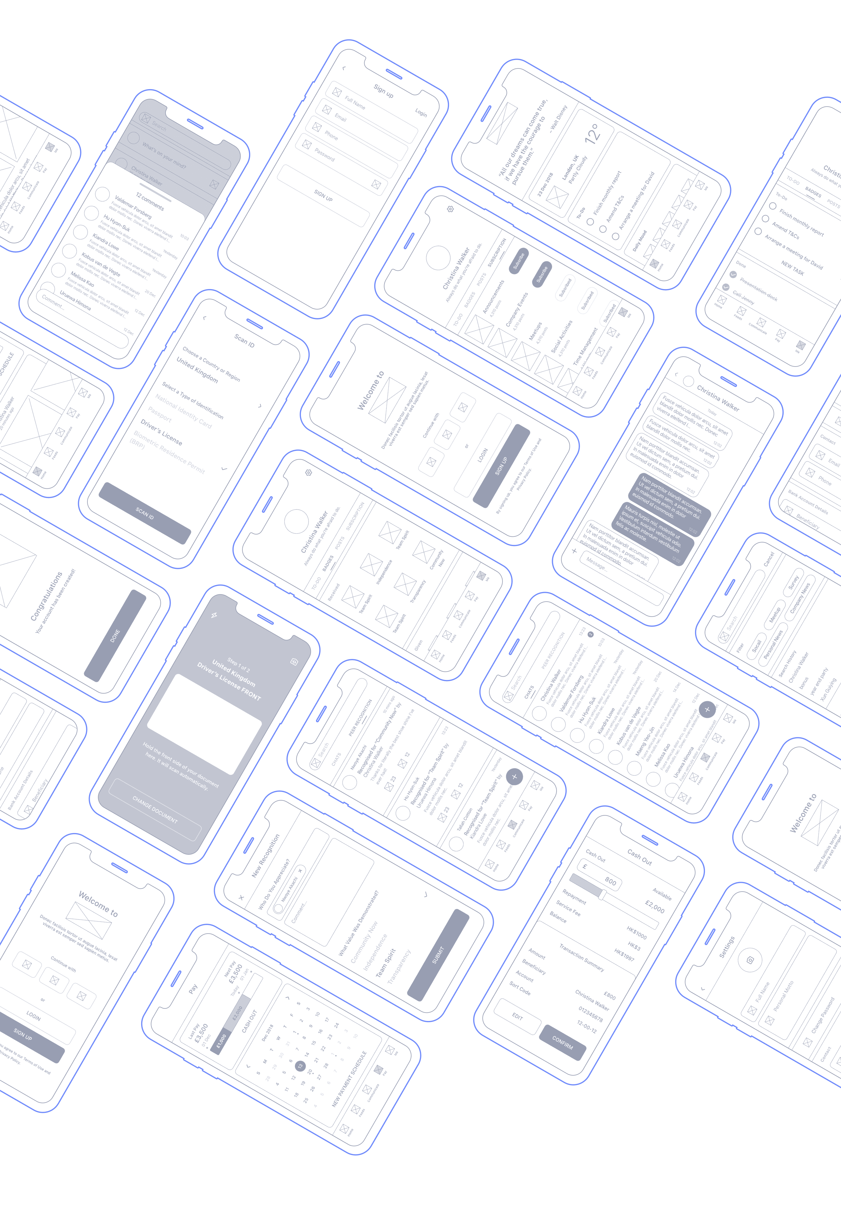
To explore various possibilities and solutions, numerous low-fidelity wireframes were created. High-fidelity wireframes and prototypes were then developed for user testing.
Style guidelines
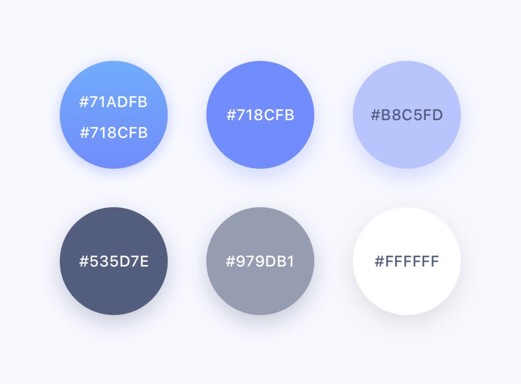
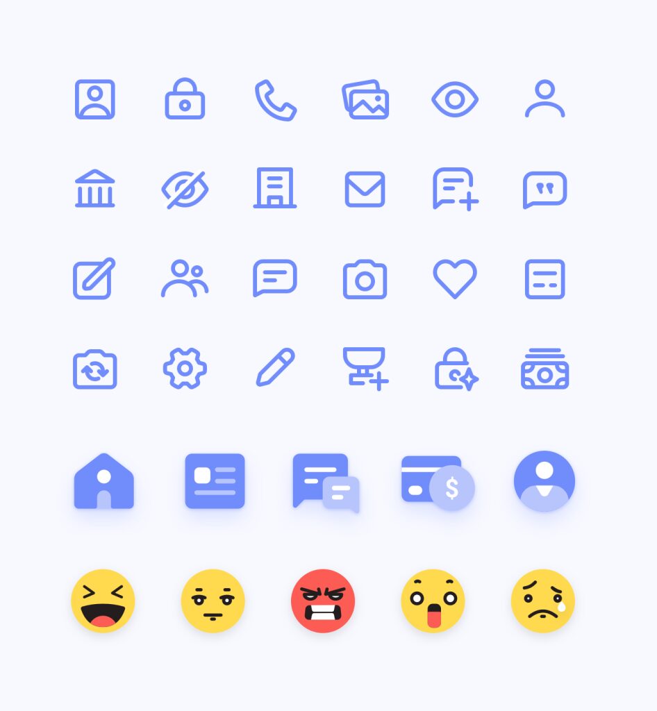
To ensure the entire app speaks the same design language, the colour palette, typography, and icon styles have been defined in the guidelines.
The colour palette is driven by calm and breezy tones to catch the user’s eye without overwhelming them, creating a modern and balanced style.
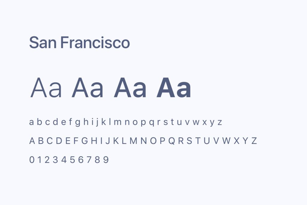
San Francisco was chosen as the primary font because it is easier to read on screen. Additionally, its small text remains readable while large text retains its beauty.
Icons are simple images that serve as intuitive symbols, helping users understand and navigate the system easily.
Interface design
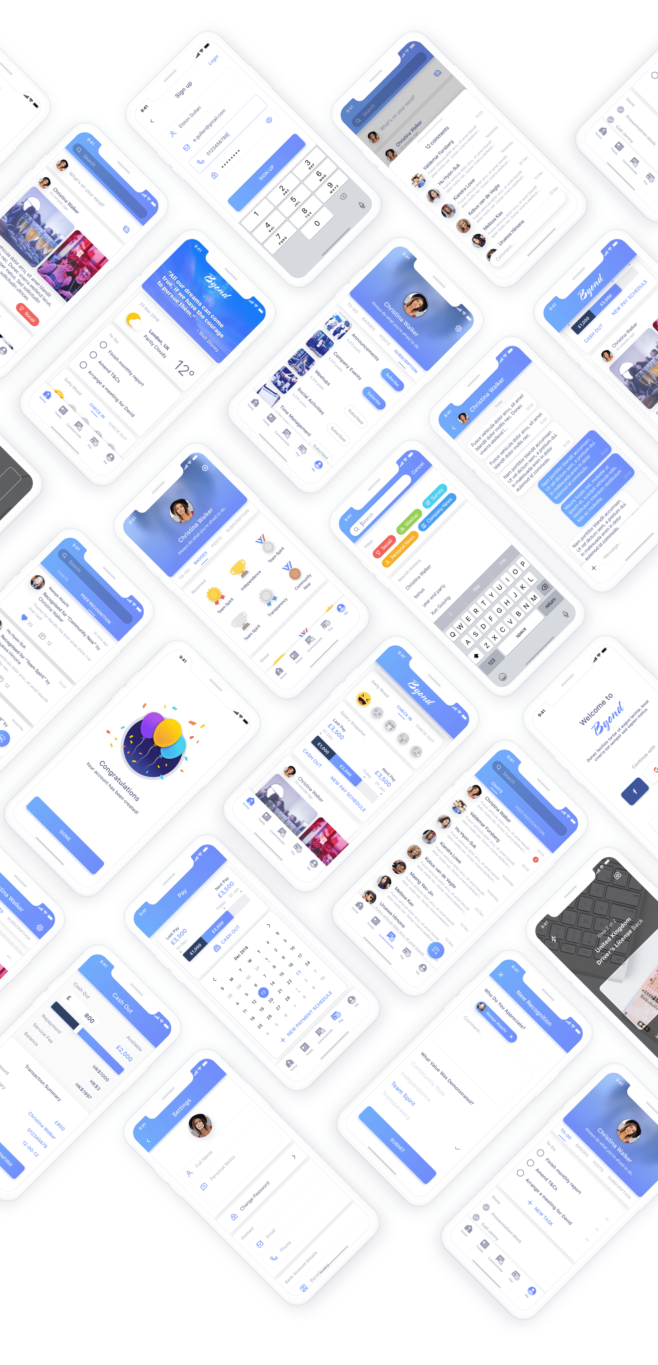
Both visual design and user flow, including transitions, are carefully considered to create a joyful user experience.
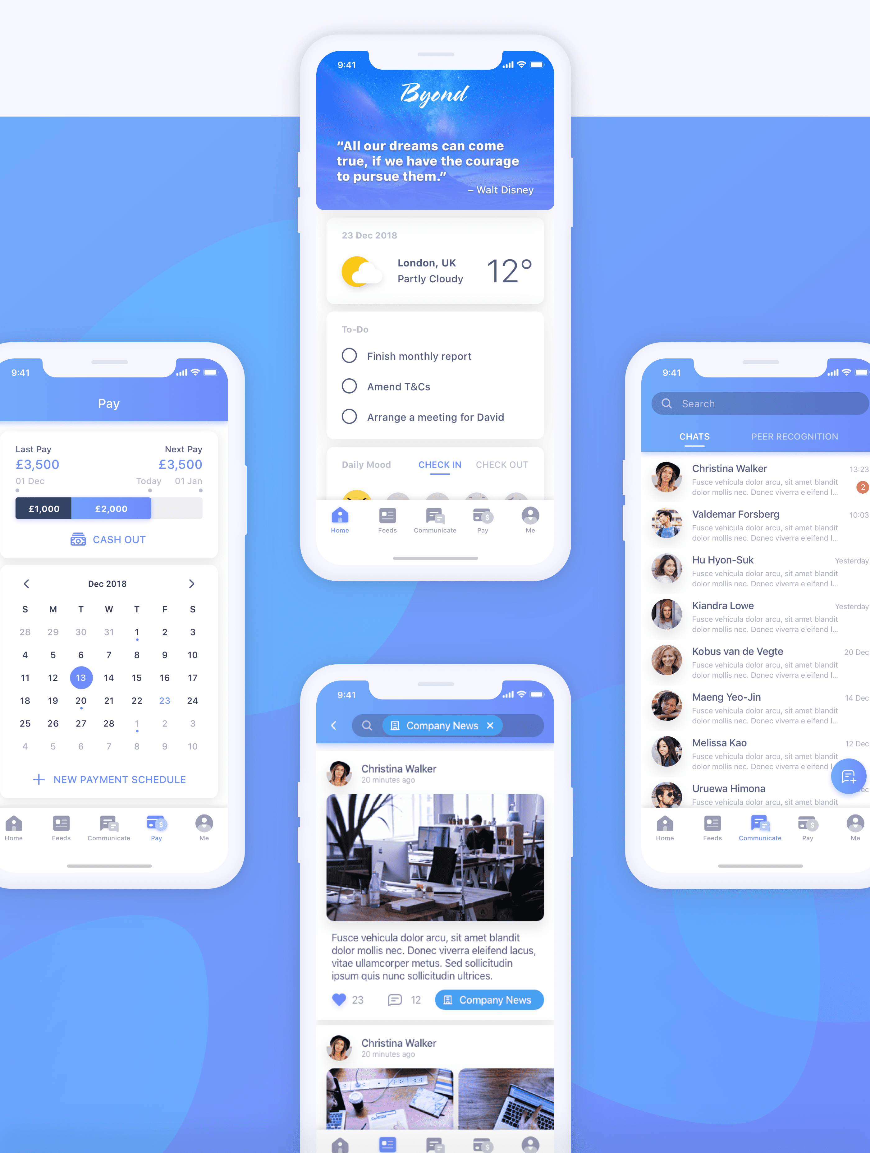
Final result
Get in touch now
To boost your business by creating better customer experiences
Gemma House
39 Lilestone Street
Marylebone
London NW8 8SS